Any chart, no matter how well designed, will mislead us if we don't pay attention to it.
- Alberto Cairo, 2019
Although we may think of data as neutral and truthful, data and their visualizations have a multitude of ways to lie to us. As viewers, it is important to critically evaluate the visualizations we view, from journalism to academic content. Data visualizations cannot be taken at face-value and should be critically assessed by viewers.
The examples below show a few of the ways that creators of data visualizations can purposefully or accidentally manipulate a chart or graph to misrepresent data.

Source: Alberto Cairo
3D perspectives in data visualizations often obscure the actual data, in this example to hide the fact that this company is not actually a market leader. 3D charts do not visualize the proportions of the data properly.

Source: Vigen, Tyler. Retrieved from http://tylervigen.com/spurious-correlations.
By showing two trend lines in one graph and having them seemingly follow the same pattern, a correlation is imposed. It requires critically reflecting on what the graph is representing, reading the title and visual elements, to determine that there is no relationship between swimming pool drownings and films Nicholas Cage appeared in, except for sheer coincidence.

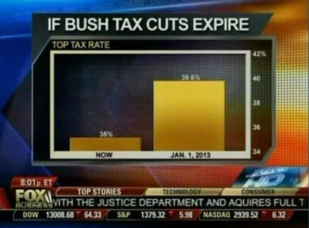
Source: Fox News, 2012.

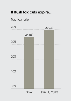
Source: Flowing Data, 2012.
Starting the Y-axis at 34 instead of 0 visually makes the change in value seem very large. If instead the axis started at 0, the change is more accurately represented at a 4.6% increase.
Source: Reuters
The Y-axis usually has 0 at the bottom and numbers increase to the top, but this axis reverses this. Though perhaps not intentional, this graph makes it appear at first glance as if murders are decreasing after 2005, though it is the opposite.

Source: The New York Times, 2016.
This visualization simplifies a complex situation with predictive analytics and flawed polling data. The reduction of the complex situation to a simple gauge chart hides the uncertainty of the data that this visualization is based on.

Source: Zerflin, 2016.
This visualization was created with the intention to show how slavery and segregation were not so long ago, but in fact are the recent past that America cannot escape. However, its aim to be simple comes at the cost of nuance: for one, the use of colours – which the creator says were chosen due to their closeness to the PanAfrican symbol’s colours, are intertwined with the red = back, green = good colour connotation – but just because slavery and segregation are not legal does not mean that everything is good for Black folks today. Further, the lack of title or description for the green 1954-present doesn’t help.
The visualization also simplifies the date of 1954 as the day that segregation ended – when it is the year of the Supreme Court declaration of School Segregation Unconstitutional in Brown v. Board of Education, but broader segregation continued after that, from the Civil Rights act in 1964, Jim Crow, and mass incarceration.